top of page


client
root of qi
2025-2026

brief
Root of Qi is a wellness practice based in Lausanne, Switzerland, offering Traditional Chinese Medicine treatments to help people find greater psycho-emotional balance and improve their overall wellbeing. As a new business, it needed a complete brand identity and digital presence that could translate its holistic approach into something clear and recognisable.
The project started with defining the brand strategy, including its mission, personality, values, and tone of voice, before moving into the visual identity. The aim was to create a brand that felt personal and hand-crafted, whilst building trust and credibility with potential clients and the community.


concept
Roots and growth were the starting point for the identity, reflecting the idea that everyone grows differently, but that growth needs a strong foundation: Root of Qi is there to provide that. Plants and organic forms naturally became recurring elements across the visual system.
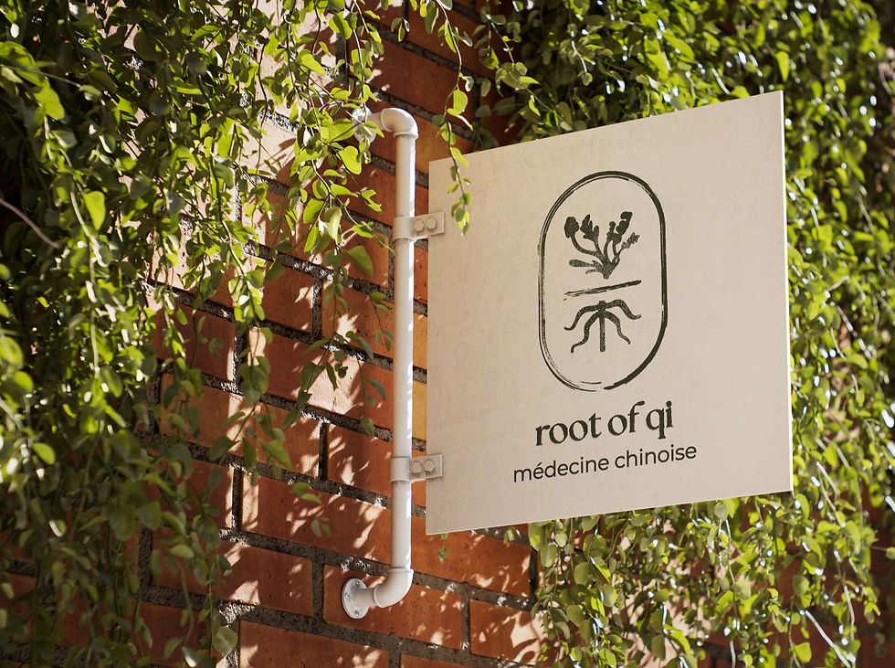
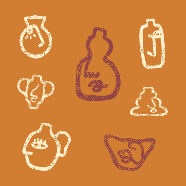
The logo was based on the client’s original plant illustration and inspired by traditional Chinese spirit plaques. It developed into a dynamic logo where the roots remain fixed, whilst the plant above can change using different hand-drawn illustrations. Some of these have been created by Root of Qi’s clients, allowing the identity to become more personal and evolve over time; just like what happens with their journeys. Earthy colours, organic textures, and natural imagery carried the same warmth and individuality across the wider brand.
brief
Root of Qi is a wellness practice based in Lausanne, Switzerland, offering Traditional Chinese Medicine treatments to help people find greater psycho-emotional balance and improve their overall wellbeing. As a new business, it needed a complete brand identity and digital presence that could translate its holistic approach into something clear and recognisable.
The project started with defining the brand strategy, including its mission, personality, values, and tone of voice, before moving into the visual identity. The aim was to create a brand that felt personal and hand-crafted, whilst building trust and credibility with potential clients and the community.
2025-2026
root of qi
client



concept
Roots and growth were the starting point for the identity, reflecting the idea that everyone grows differently, but that growth needs a strong foundation: Root of Qi is there to provide that. Plants and organic forms naturally became recurring elements across the visual system.
The logo was based on the client’s original plant illustration and inspired by traditional Chinese spirit plaques. It developed into a dynamic logo where the roots remain fixed, whilst the plant above can change using different hand-drawn illustrations. Some of these have been created by Root of Qi’s clients, allowing the identity to become more personal and evolve over time; just like what happens with their journeys. Earthy colours, organic textures, and natural imagery carried the same warmth and individuality across the wider brand.
outcome
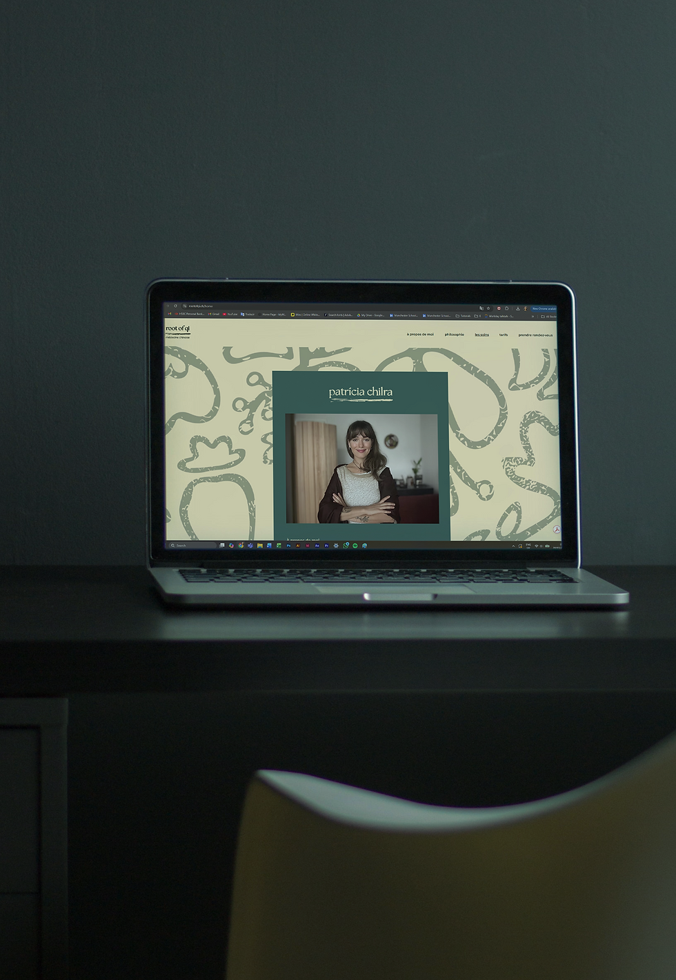
The final outcome was a complete brand identity and strategy, covering everything from brand guidelines and custom illustrations to business cards, flyers, and social media assets. A fully functioning website was also designed and built, bringing the practice, treatments and wider brand together in one place.
The system was designed with enough flexibility to grow with the business, whilst giving Root of Qi a professional and approachable presence as it establishes itself within the local community.
outcome
The final outcome was a complete brand identity and strategy, covering everything from brand guidelines and custom illustrations to business cards, flyers, and social media assets. A fully functioning website was also designed and built, bringing the practice, treatments and wider brand together in one place.
The system was designed with enough flexibility to grow with the business, whilst giving Root of Qi a professional and approachable presence as it establishes itself within the local community.





bottom of page